


Visualization
Every plotting function returns a matplotlib Figure, so you can save it, embed
it, or customize it further. All plots use a validated, colorblind-considered
dark theme — a fixed categorical order, a single-hue blue sequential ramp for
magnitude, and neutral ink/grid tokens tuned for the dark surface. Importing
jaxfolio.viz registers the theme globally.
from jaxfolio import viz

fig = viz.plot_weights(result)
viz.save(fig, "weights.png", dpi=150)     # preserves the dark background
The composite dashboard
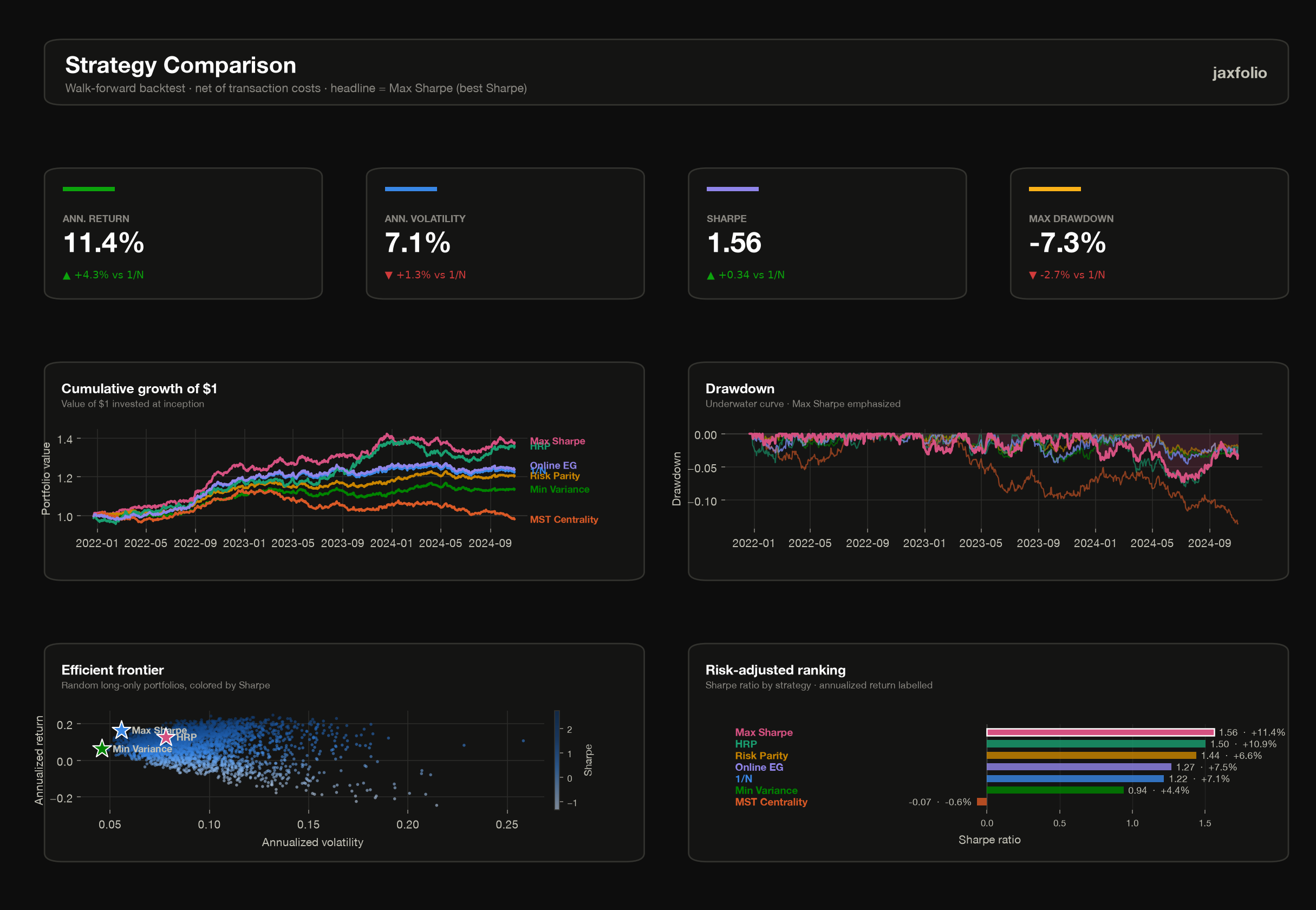
dashboard is the headline
report: a KPI strip for the best strategy (by Sharpe), equity curves, drawdown,
the efficient frontier, and a risk-adjusted ranking — laid out on a clean
reporting grid.
results— a{name: BacktestResult}map fromcompare.highlight— an optional{name: PortfolioResult}map overlaid on the frontier.
Portfolio plots
| Function | Shows |
|---|---|
plot_weights |
horizontal bar chart of holdings (largest on top) |
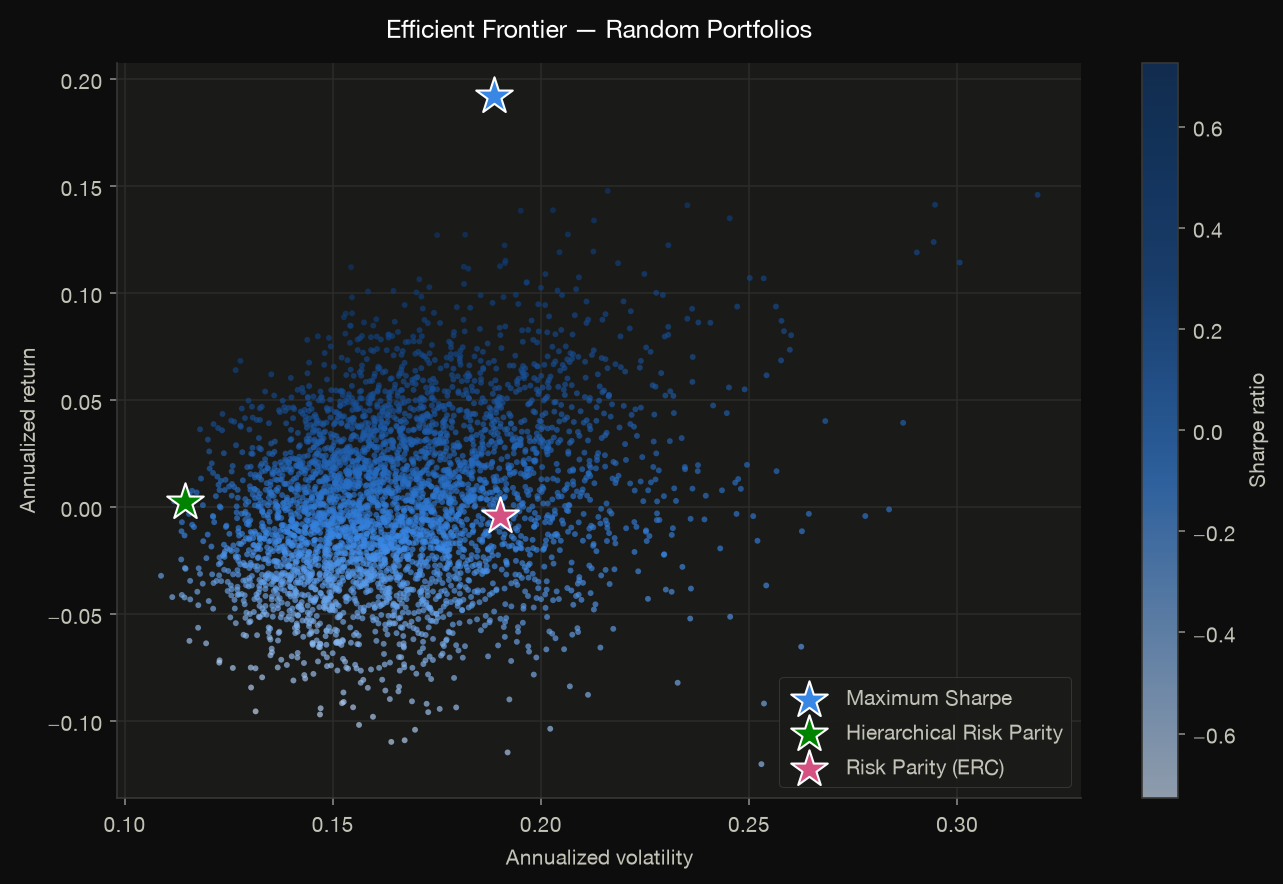
plot_efficient_frontier |
Monte-Carlo frontier colored by Sharpe, with method markers |
plot_risk_contributions |
per-asset risk contribution (uses ERC metadata) |
plot_weight_evolution |
stacked-area weight history over a backtest |
viz.save(viz.plot_efficient_frontier(returns, highlight=highlight), "frontier.png")
viz.save(viz.plot_risk_contributions(jf.risk_parity(returns)), "risk_contrib.png")
Backtest plots
| Function | Shows |
|---|---|
plot_equity_curves |
cumulative growth of $1, direct-labeled |
plot_drawdown |
underwater (drawdown) curves |
plot_metrics_table |
a styled metrics comparison table |
viz.save(viz.plot_equity_curves(results), "equity.png")
viz.save(viz.plot_drawdown(results), "drawdown.png")
Multi-period plots
A multi-period result carries a whole (T, N) weight plan
rather than one vector, so it gets its own plots: these label integer periods
instead of dates and anchor period 0 at the book the plan starts from. They raise
a clear ValueError on a single-period result.
| Function | Shows |
|---|---|
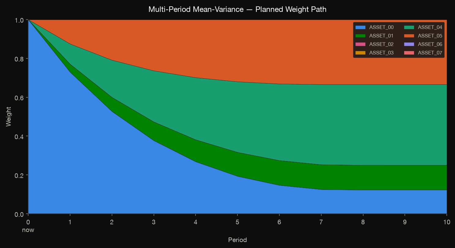
plot_weight_path |
the planned trajectory as stacked bands (lines when it shorts), starting from current holdings |
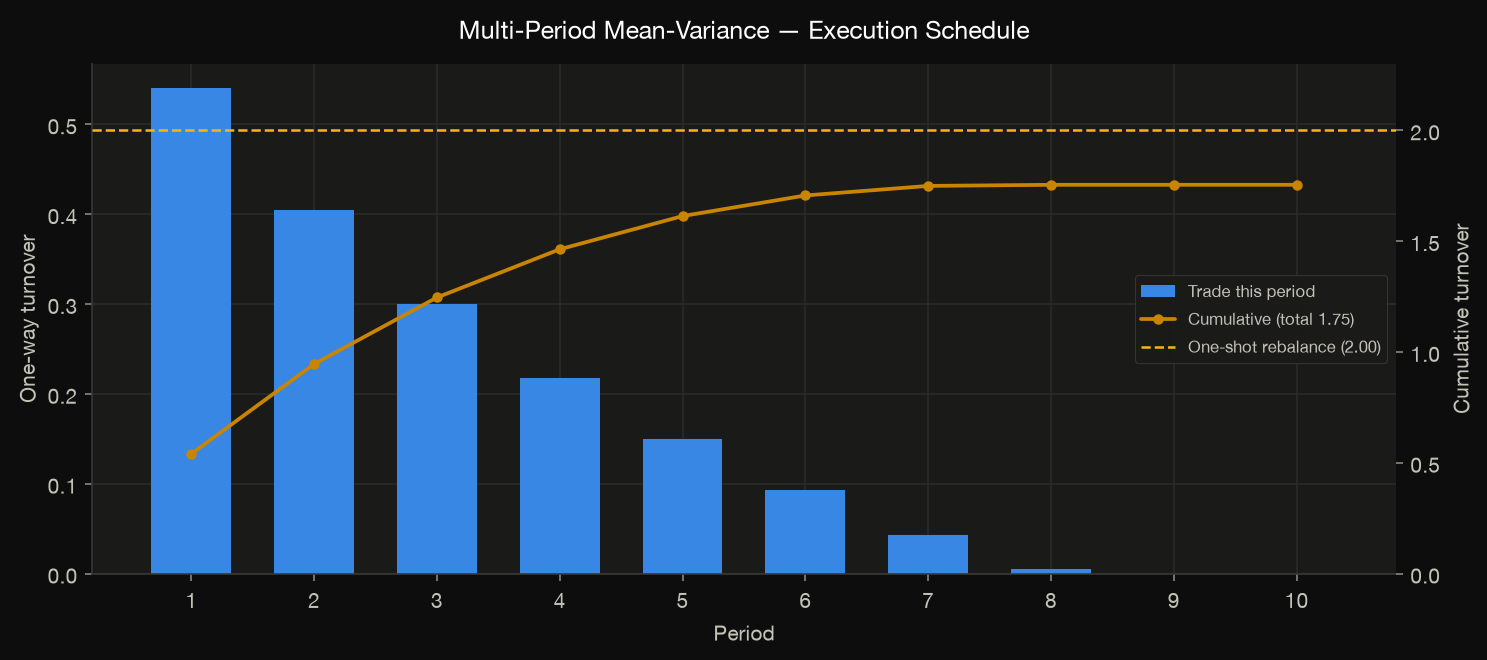
plot_turnover_schedule |
trade size per period plus cumulative turnover — the diagnostic for whether execution is actually spread |
plot_path_convergence |
distance to the terminal target per period; flags a horizon that is too short |
plot_cost_comparison |
execution schedules across cost assumptions, side by side |
multiperiod_dashboard |
one-page report: KPI strip, path, schedule, convergence, cost regimes |
res = jf.multi_period_mean_variance(
    returns, horizon=10, w_prev=holdings,
    costs=jf.TradingCosts(spread_bps=10.0, impact_bps=100.0),
)
viz.save(viz.plot_weight_path(res), "glidepath.png")

# Pass an external target so the "one-shot" reference measures something: the
# plan's own terminal weights would be a tautology, since a monotone path's total
# turnover equals |w_T - w_prev| identically.
myopic = jf.mean_variance(returns).weights
viz.save(viz.plot_turnover_schedule(res, reference_weights=myopic), "schedule.png")
viz.save(viz.multiperiod_dashboard(res, reference_weights=myopic), "plan.png")
Structure & correlation plots
| Function | Shows |
|---|---|
plot_correlation_heatmap |
clustered correlation matrix (diverging blue↔red) |
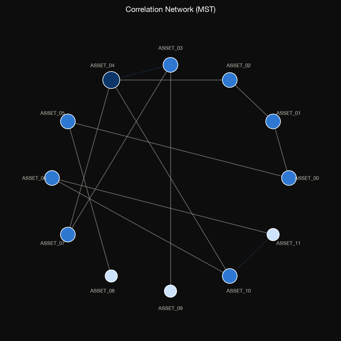
plot_correlation_network |
MST correlation network, node size = degree |
plot_dendrogram |
HRP linkage dendrogram (needs HRP metadata) |
viz.save(viz.plot_correlation_network(returns), "network.png")
viz.save(viz.plot_dendrogram(jf.hierarchical_risk_parity(returns)), "dendrogram.png")
Options plots
| Function | Shows |
|---|---|
plot_payoff |
payoff-at-expiry, profit/loss shaded, break-evens marked |
plot_greeks_profile |
net Greeks vs. spot (delta / gamma / vega / theta) |
plot_vol_surface |
implied-volatility surface as a filled contour |
viz.save(viz.plot_payoff(condor, spot=100), "payoff.png")
viz.save(viz.plot_greeks_profile(condor, spot=100, vol=0.22), "greeks.png")
The theme
The palette lives in jaxfolio.viz.theme. To reuse the
categorical colors in your own matplotlib code:
from jaxfolio.viz import theme

theme.color(0)          # first categorical color, applied in fixed order
theme.SEQUENTIAL_CMAP   # single-hue blue ramp for magnitude
theme.DIVERGING_CMAP    # blue↔red for signed magnitude (e.g. correlation)
theme.use_dark_theme()  # (re)register the rcParams
Colors carry meaning
The status accents (GOOD, WARNING, CRITICAL) are reserved and never
reused as a series color, and the categorical order is applied in sequence
rather than cycled arbitrarily — so identity never rests on color alone.